By SPARK_JOE,
The Original Material Guy 12/7/2016
If you use the SparkPeople Mobile app on an Android device, you may have noticed things look a little different today. Cleaner and quicker. Easier on the eye. Just…better.
It’s true, we did make some changes to our app. (Good eye.  ) Starting today, you can download the newest version of SparkPeople Mobile, which now conforms to the standards of Material Design. ) Starting today, you can download the newest version of SparkPeople Mobile, which now conforms to the standards of Material Design.
What Is Material Design?
It’s a design language that Google developed a few years ago for all of its websites and apps. (If you use Gmail, YouTube or Google Maps, you might recognize some of the design elements that you now see in our app.) Google developed the design structure to make sure their apps looked good and were easy to use. After they rolled out the design to their own apps, they provided all Android app developers the specifications for their new language.
Why Bring Material Design to SparkPeople Mobile?
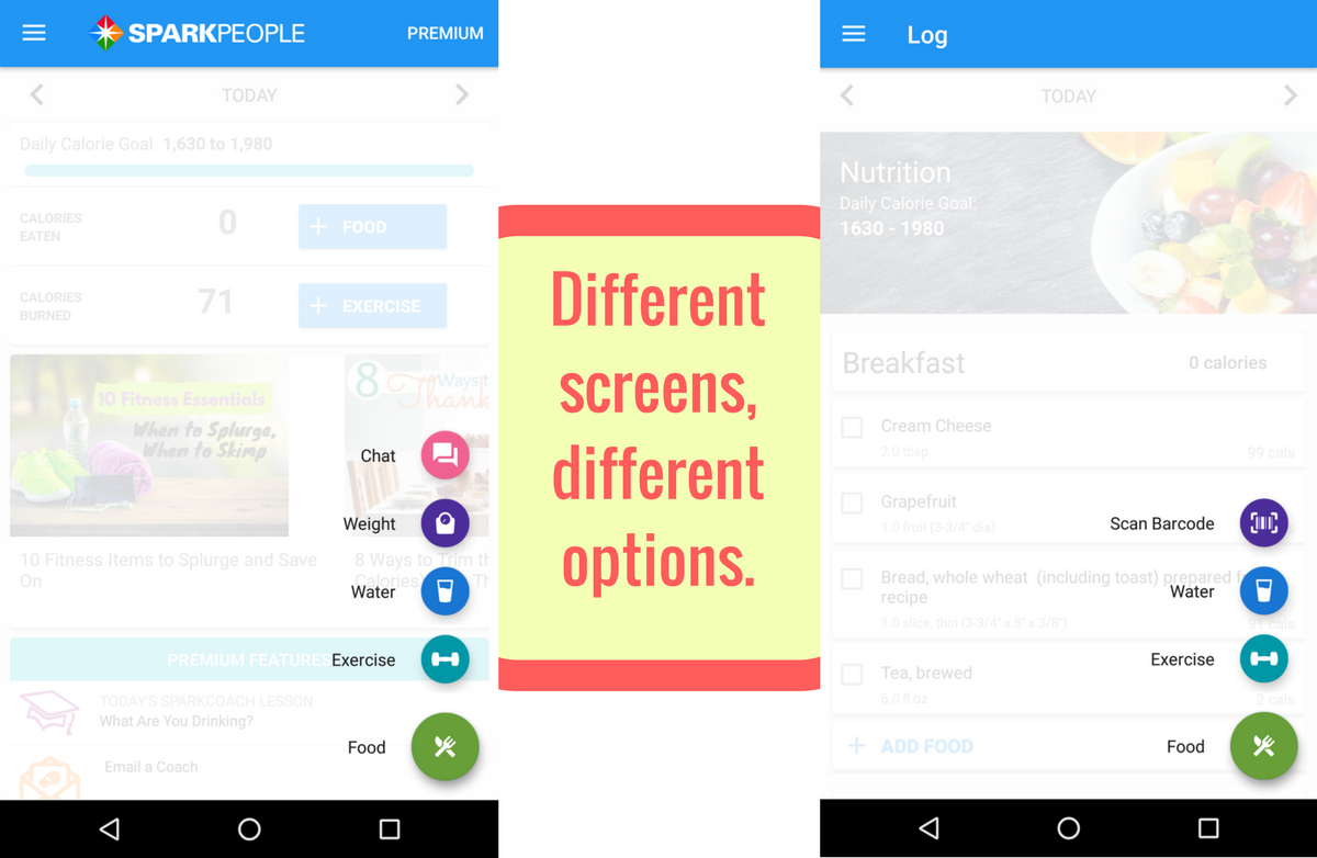
Our new design makes the app easier on the eyes, but also so much easier to use. For example, we got rid of the navigation bar at the bottom of the screen. Instead of clicking through the app by finding the right menu or submenu, you can now use the small, blue “plus” button at the bottom right of the screen. This button will open a series of options for you to select, depending on which screen you’re on. As you can see, the options on the home screen are pretty different than the options on the Log page:
By giving you options based on the screen you’re on, we can help you get around the app faster.
One Hamburger, Simplified Navigation
Another thing you might notice--after you’ve poked around a bit--is that we didn’t get rid of the navigation altogether; we just made the navigation much, much easier to use. Check out the three horizontal lines at the top left of every screen (in the design world, we call this a hamburger menu). We’ve put all of the different sections of the app in this hamburger menu, in a logical, easy-to-understand order. No more clicking around the app, trying to figure out how to get to a screen you can’t locate. Now, just click the hamburger and go where you need to be.
Quick note on the Friend Feed: we kept your Friend Feed at the bottom of the homescreen, because it just seemed to fit there. So if you're having a problem finding the friend feed, just scroll down to the bottom of your home scren. ;)
Poke around the app and let us know what you think! We’ve been using the app internally for a few weeks now and we just love the design, and we hope you will too.
But Wait, There's More!
Starting today, with this new version of the app, all SparkPeople Premium members can now export their individual health and fitness data into a spreadsheet. (All Premium members can now use this feature, but only Android users can do this in the app. Don’t worry iOS users--this feature will be coming to your app in a few weeks.)
Why does this matter? Because it’s your data and you should be able to do what you want with it. One of the main perks of Premium is the advanced reporting it provides, and this seemed like the logical next step to us. You can request a download on the Premium screen in the app, or the Premium page on our site and we’ll send you a link to download your report once it’s ready. So for all you spreadsheet nerds out there (I know there’s more of you than just me), get ready to get analytical!
And if you don’t have Premium yet, but have really been thinking about it, why don’t you treat yourself? It’s only a $30, one-time payment (not yearly), and it’s so, so good.
As always, we’d love to hear what you think about the new changes. Leave us a comment below withquestions, concerns or compliments and we’ll make sure to reply.
|
|


.jpg)


.jpg)


.png&description=Android App Update: New Design, New Premium Features!)